Design Strategy
Brand Essence
Tagline Provided: Illuminate Your Natural Beauty. Own Your Glow.
Brand Values: Authenticity, Clean Beauty, Confidence, Holistic Self-Care
Visual Direction
Mood: Calm, radiant, fresh sophistication
Keywords: Glow, purity, modern minimalism, real beauty
Visual Identity Development
Logo Design
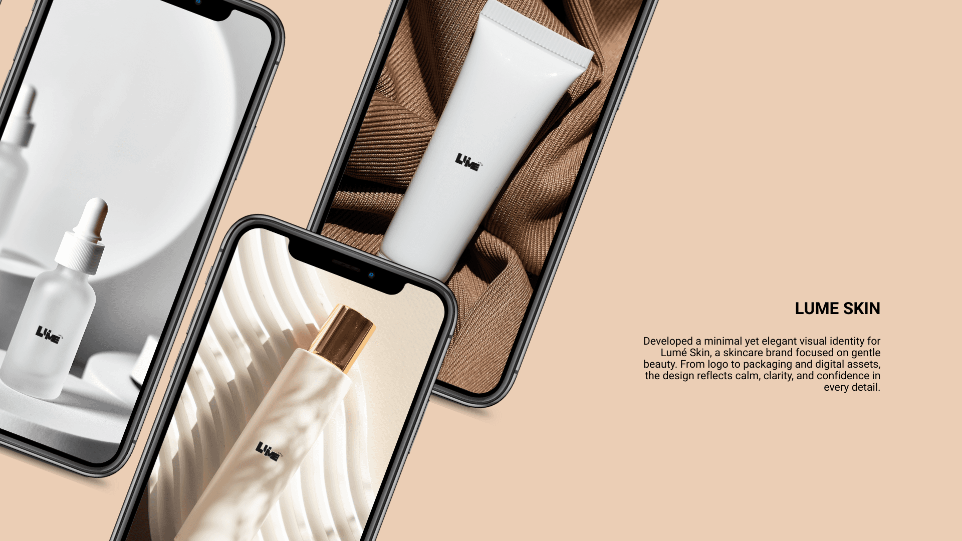
Created a minimalist wordmark with gentle custom curves to reflect softness and approachability.
Color Palette
Primary Colors: Neutrals — Black and White
Accent Tones: Subtle — Beige to hint at luxury
Mood: Warm, fresh, understated elegance
Typography
Primary Typeface: Source Sans Pro (for approachability)
Secondary Typeface: Light Source Sans Pro (for ingredient and scientific callouts)
Imagery Direction
Photography
Recommended photography style emphasizing natural textures, dewy skin, and inclusive casting.
Proposed using natural lighting and minimal retouching to highlight authenticity.
Packaging Concept
Transparent or frosted glass bottles
Minimalist label design with clear product hierarchy
Eco-conscious materials with soft tactile finishes
Challenges and Solutions
Challenge:
Differentiating Lume Skin in a saturated market without leaning on predictable "natural beauty" visual clichés.
Solution:
Focus on illumination and emotional minimalism — using a softer, more human-centered aesthetic that emphasizes skincare as a self-care ritual, not just a clinical routine.
PROJECT BRIEF AND ANALYSIS
I developed the brand identity for Lume Skin, a skincare brand focused on clean formulations, ingredient transparency, and promoting natural beauty.
The brand was envisioned to feel modern, minimal, and emotionally resonant, speaking to consumers who see skincare as an essential part of self-care and wellness.
I was supposed to translate these ideas into a cohesive visual system, including logo design, color palette, typography, and packaging concepts.
The client needed:
A visual identity that feels clean but emotionally warm — avoiding sterile, clinical aesthetics.
Branding that reflects ingredient integrity and holistic self-care values.
A look that could differentiate Lume Skin in the highly competitive clean beauty market while appealing to a broad, diverse audience.
Key Objectives:
Develop a flexible, recognizable logo system.
Establish a sophisticated but approachable color palette and typography.
Create packaging concepts that convey purity, radiance, and modern luxury.
Primary Logo and Submark
Color Palette and Typography Guidelines
Packaging Mood Concepts
Art Direction Guidelines for Photography
Brand Usage Presentation for Client Handoff
The final brand identity for Lume Skin captures the essence of modern skincare confidence — minimal yet warm, scientific yet personal.
Through strategic design, I was able to translate the client's vision into a visual identity that supports both their business goals and their emotional connection with the target audience.
This project reflects my ability to strategically research markets, develop emotional design systems, and execute cohesive visual storytelling for modern wellness and beauty brands.
Final Deliverables
LOGO
Conclusion
Tools Used
LUME SKIN: BRAND IDENTITY DEVELOPMENT
Illuminate Your Natural Beauty. Own Your Glow.
To ensure Lume Skin’s branding would stand out, I conducted a focused competitive analysis, studying brands like:
The Ordinary (clinical, stripped-down)
Glossier (youthful, soft minimalism)
Fenty Skin (inclusive, energetic, polished)
Key Insights:
Many skincare brands leaned too heavily into either science or trendiness.
There was a clear opportunity to position Lume Skin as confident, nurturing, modern, and credible — blending scientific trust with emotional connection.
RESEARCH AND COMPETITIVE ANALYSIS
MOODBOARD


Design Strategy
Brand Essence
Tagline Provided: Illuminate Your Natural Beauty. Own Your Glow.
Brand Values: Authenticity, Clean Beauty, Confidence, Holistic Self-Care
Visual Direction
Mood: Calm, radiant, fresh sophistication
Keywords: Glow, purity, modern minimalism, real beauty
Visual Identity Development
Logo Design
Created a minimalist wordmark with gentle custom curves to reflect softness and approachability.
Color Palette
Primary Colors: Neutrals — Black and White
Accent Tones: Subtle — Beige to hint at luxury
Mood: Warm, fresh, understated elegance
Typography
Primary Typeface: Source Sans Pro (for approachability)
Secondary Typeface: Light Source Sans Pro (for ingredient and scientific callouts)
Imagery Direction
Photography
Recommended photography style emphasizing natural textures, dewy skin, and inclusive casting.
Proposed using natural lighting and minimal retouching to highlight authenticity.
Packaging Concept
Transparent or frosted glass bottles
Minimalist label design with clear product hierarchy
Eco-conscious materials with soft tactile finishes
Challenges and Solutions
Challenge:
Differentiating Lume Skin in a saturated market without leaning on predictable "natural beauty" visual clichés.
Solution:
Focus on illumination and emotional minimalism — using a softer, more human-centered aesthetic that emphasizes skincare as a self-care ritual, not just a clinical routine.
PROJECT BRIEF AND ANALYSIS
I developed the brand identity for Lume Skin, a skincare brand focused on clean formulations, ingredient transparency, and promoting natural beauty.
The brand was envisioned to feel modern, minimal, and emotionally resonant, speaking to consumers who see skincare as an essential part of self-care and wellness.
I was supposed to translate these ideas into a cohesive visual system, including logo design, color palette, typography, and packaging concepts.
The client needed:
A visual identity that feels clean but emotionally warm — avoiding sterile, clinical aesthetics.
Branding that reflects ingredient integrity and holistic self-care values.
A look that could differentiate Lume Skin in the highly competitive clean beauty market while appealing to a broad, diverse audience.
Key Objectives:
Develop a flexible, recognizable logo system.
Establish a sophisticated but approachable color palette and typography.
Create packaging concepts that convey purity, radiance, and modern luxury.
Primary Logo and Submark
Color Palette and Typography Guidelines
Packaging Mood Concepts
Art Direction Guidelines for Photography
Brand Usage Presentation for Client Handoff
The final brand identity for Lume Skin captures the essence of modern skincare confidence — minimal yet warm, scientific yet personal.
Through strategic design, I was able to translate the client's vision into a visual identity that supports both their business goals and their emotional connection with the target audience.
This project reflects my ability to strategically research markets, develop emotional design systems, and execute cohesive visual storytelling for modern wellness and beauty brands.
Final Deliverables
LOGO
Conclusion
Tools Used
To ensure Lume Skin’s branding would stand out, I conducted a focused competitive analysis, studying brands like:
The Ordinary (clinical, stripped-down)
Glossier (youthful, soft minimalism)
Fenty Skin (inclusive, energetic, polished)
Key Insights:
Many skincare brands leaned too heavily into either science or trendiness.
There was a clear opportunity to position Lume Skin as confident, nurturing, modern, and credible — blending scientific trust with emotional connection.
RESEARCH AND COMPETITIVE ANALYSIS
MOODBOARD
Design Strategy
Brand Essence
Tagline Provided: Illuminate Your Natural Beauty. Own Your Glow.
Brand Values: Authenticity, Clean Beauty, Confidence, Holistic Self-Care
Visual Direction
Mood: Calm, radiant, fresh sophistication
Keywords: Glow, purity, modern minimalism, real beauty
Visual Identity Development
Logo Design
Created a minimalist wordmark with gentle custom curves to reflect softness and approachability.
Color Palette
Primary Colors: Neutrals — Black and White
Accent Tones: Subtle — Beige to hint at luxury
Mood: Warm, fresh, understated elegance
Typography
Primary Typeface: Source Sans Pro (for approachability)
Secondary Typeface: Light Source Sans Pro (for ingredient and scientific callouts)
Imagery Direction
Photography
Recommended photography style emphasizing natural textures, dewy skin, and inclusive casting.
Proposed using natural lighting and minimal retouching to highlight authenticity.
Packaging Concept
Transparent or frosted glass bottles
Minimalist label design with clear product hierarchy
Eco-conscious materials with soft tactile finishes
Challenges and Solutions
Challenge:
Differentiating Lume Skin in a saturated market without leaning on predictable "natural beauty" visual clichés.
Solution:
Focus on illumination and emotional minimalism — using a softer, more human-centered aesthetic that emphasizes skincare as a self-care ritual, not just a clinical routine.
PROJECT BRIEF AND ANALYSIS
I developed the brand identity for Lume Skin, a skincare brand focused on clean formulations, ingredient transparency, and promoting natural beauty.
The brand was envisioned to feel modern, minimal, and emotionally resonant, speaking to consumers who see skincare as an essential part of self-care and wellness.
I was supposed to translate these ideas into a cohesive visual system, including logo design, color palette, typography, and packaging concepts.
The client needed:
A visual identity that feels clean but emotionally warm — avoiding sterile, clinical aesthetics.
Branding that reflects ingredient integrity and holistic self-care values.
A look that could differentiate Lume Skin in the highly competitive clean beauty market while appealing to a broad, diverse audience.
Key Objectives:
Develop a flexible, recognizable logo system.
Establish a sophisticated but approachable color palette and typography.
Create packaging concepts that convey purity, radiance, and modern luxury.
Primary Logo and Submark
Color Palette and Typography Guidelines
Packaging Mood Concepts
Art Direction Guidelines for Photography
Brand Usage Presentation for Client Handoff
The final brand identity for Lume Skin captures the essence of modern skincare confidence — minimal yet warm, scientific yet personal.
Through strategic design, I was able to translate the client's vision into a visual identity that supports both their business goals and their emotional connection with the target audience.
This project reflects my ability to strategically research markets, develop emotional design systems, and execute cohesive visual storytelling for modern wellness and beauty brands.
Final Deliverables
LOGO
Conclusion
Tools Used
MOODBOARD
To ensure Lume Skin’s branding would stand out, I conducted a focused competitive analysis, studying brands like:
The Ordinary (clinical, stripped-down)
Glossier (youthful, soft minimalism)
Fenty Skin (inclusive, energetic, polished)
Key Insights:
Many skincare brands leaned too heavily into either science or trendiness.
There was a clear opportunity to position Lume Skin as confident, nurturing, modern, and credible — blending scientific trust with emotional connection.
RESEARCH AND COMPETITIVE ANALYSIS
LUME SKIN: BRAND IDENTITY DEVELOPMENT
Illuminate Your Natural Beauty. Own Your Glow.
LUME SKIN: BRAND IDENTITY DEVELOPMENT
Illuminate Your Natural Beauty. Own Your Glow.